Bakers Delight
Branding | Adobe Illustrator, Adobe InDesign & Adobe Photoshop
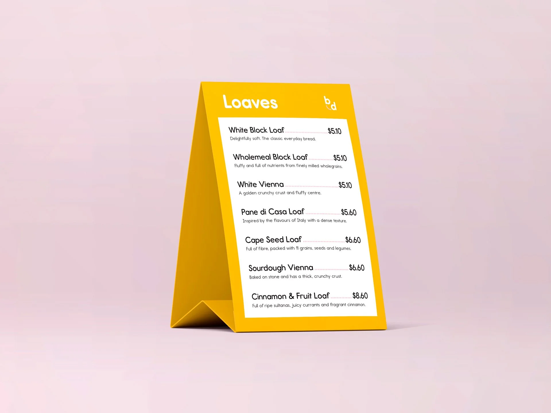
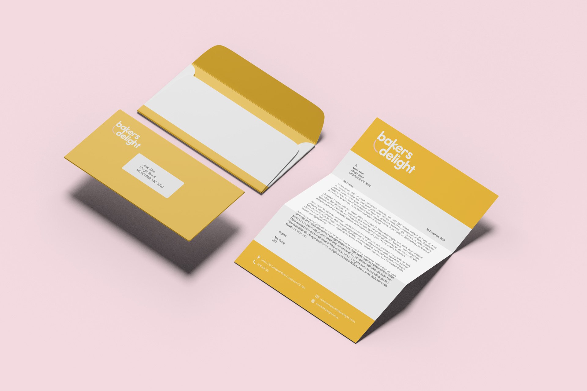
A speculative refreshed visual identity for the go-to Australian bakery chain that reflects its values of dependability, warmth and approachability.
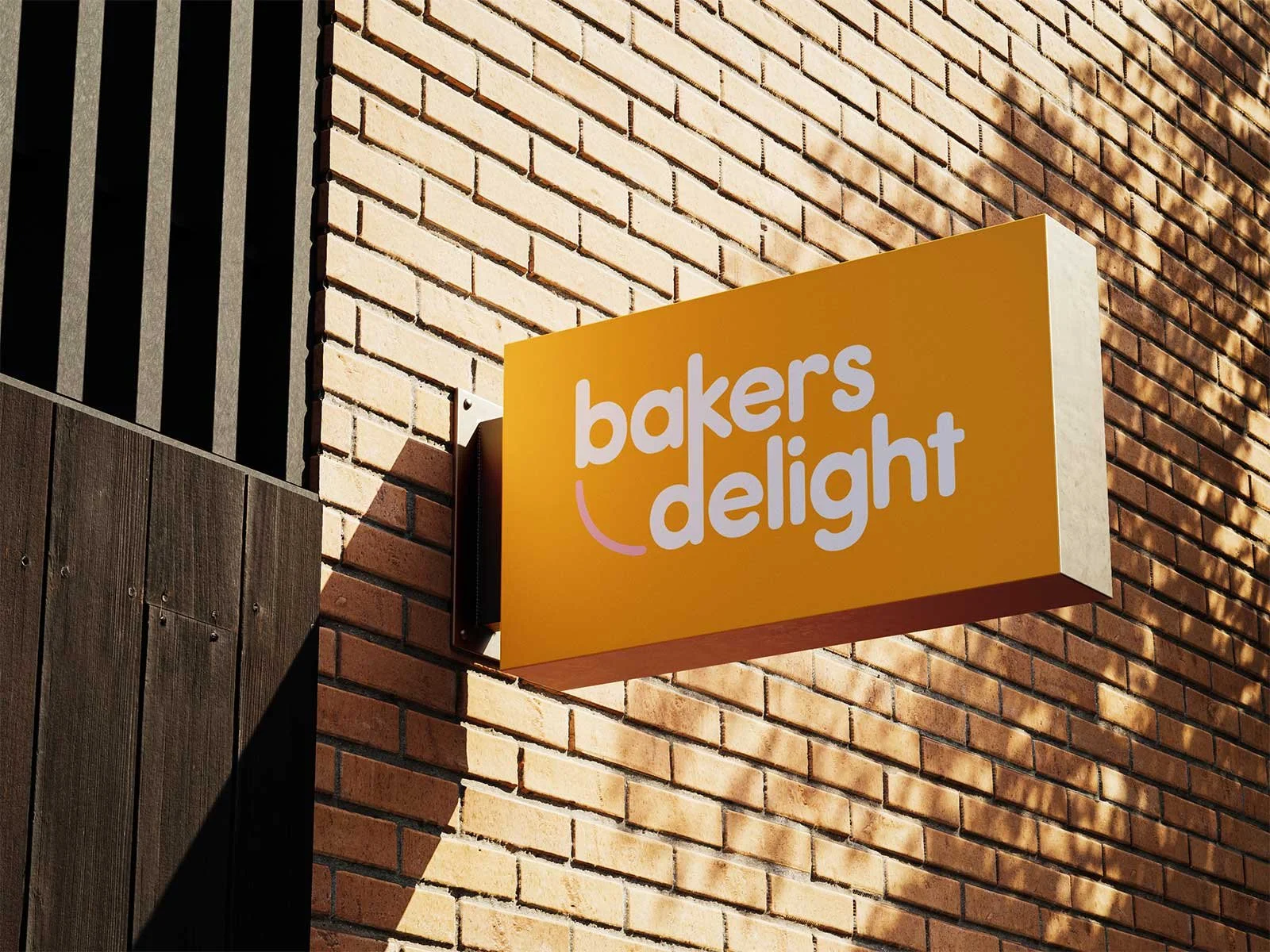
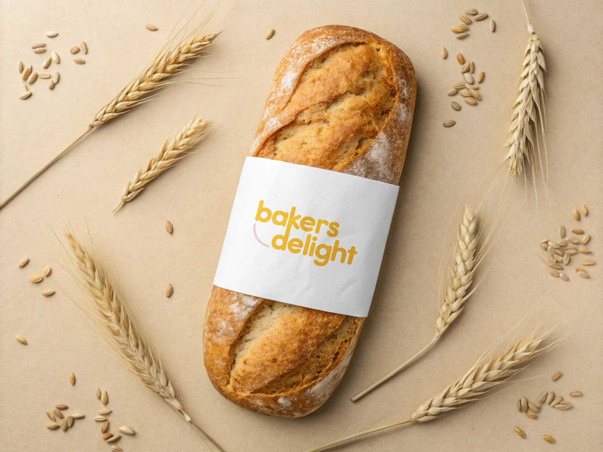
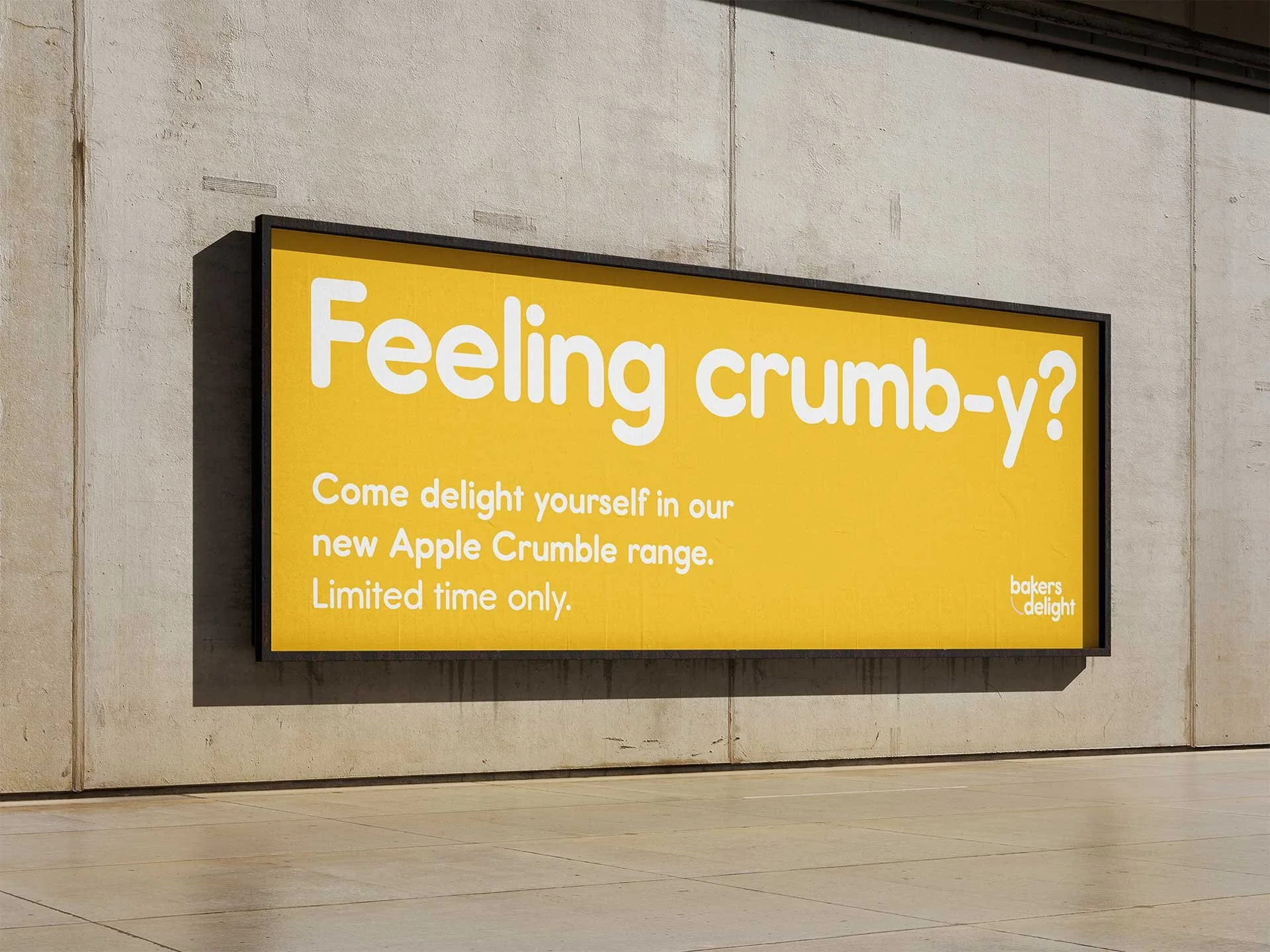
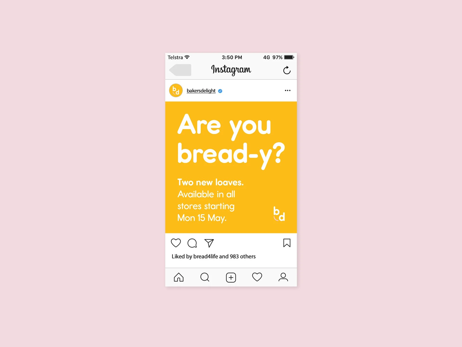
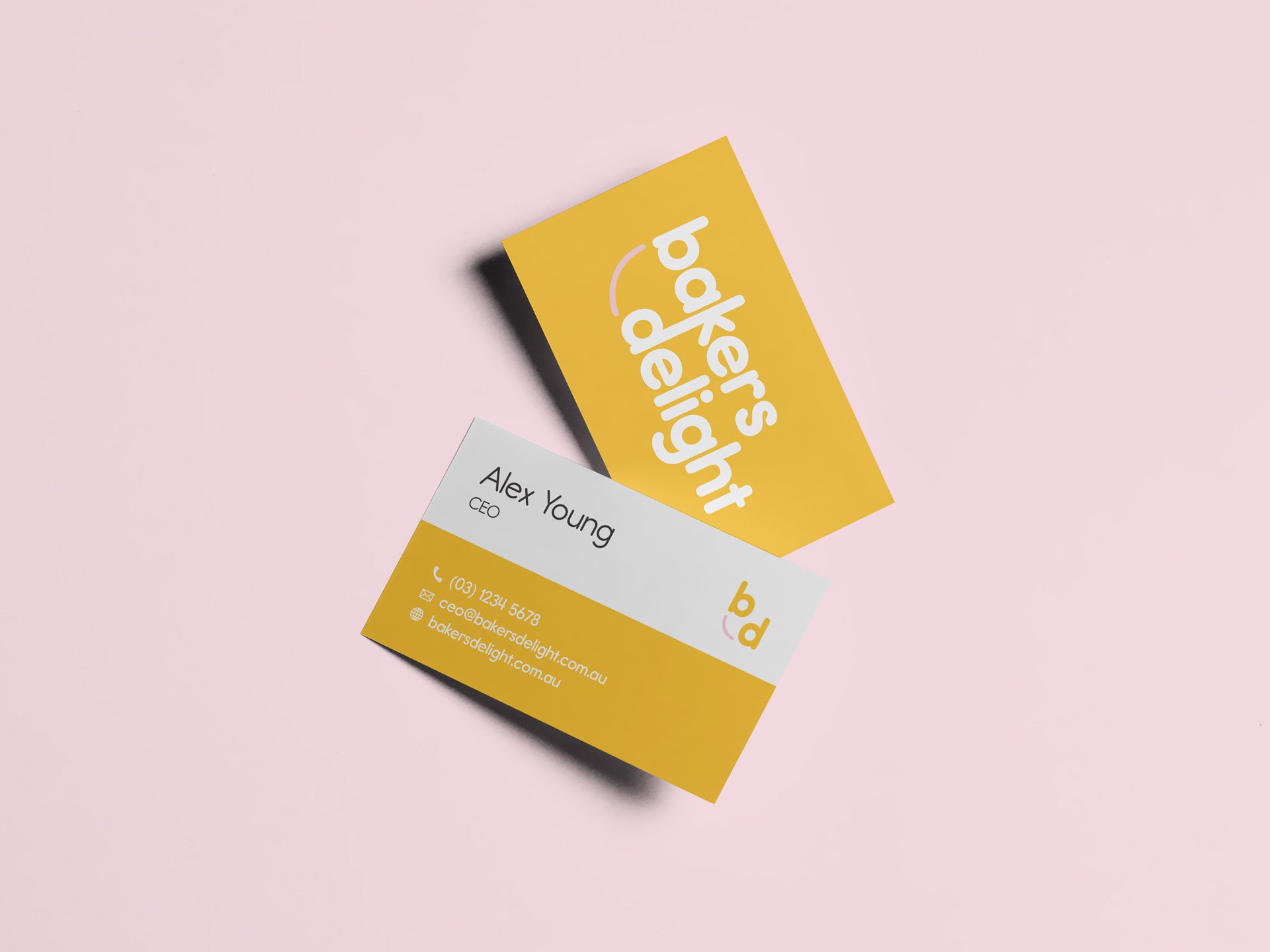
The pink line connecting each of the brandmark’s first letters creates a smiling face, communicating the happiness one feels when smelling fresh baked goods. The brandmark’s curved line endings, as well as the warm colour palette, further convey approachability. The choice of yellow is an alternative to the red used in many bakery visual identities.
This visual identity revitalises the brand, while reassuring customers that their beloved bakery is as reliable as ever.